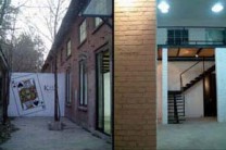
The Rockbund Art Museum had the prospect to be beyond MOCA Shanghai good, and the first two solo shows they delivered, of Cai Guoqiang and Zeng Fanzhi were of internationally renowned names who did not disappoint. But their first group show, a satellite exhibition during the Shanghai Biennale named “By Day By Night” really did not meet our lowest expectation. It was really hard for us to tell if this show was serious, as the exhibition looked like something thrown together in a few weeks as a fill-in, and most of the work in the show was greatly underwhelming, if not a little amateur and ridiculous at times. Of course, the curator Hou Hanru made a point of not making the point by the exhibition solely. “By Day By Night”’s days and nights were supposed to be reckoned equally important, but when we got there, we were handed a pamphlet that looked like an Expo Passport but really, seemed like a special edition of the “Pirate DVD Guide” magazine, that listed the films recommended by the participating artists. It’s not that we doubt the artists’ recommendations of films (Godfather, Run Lola Run etc.) aren’t genuine or good. It’s that they are all easily available in a DVD store near you. The idea could have worked elsewhere, or that they could have brought film stocks, but not like this. And even so, whoever recommended Amadeus or Romance on Lushan Mountain…oh well. (Strikingly, for all the video artists in the show, the only gallery art film recommended was a William Kentridge work.)
The evening sessions, consisted mainly of the film screenings and lectures could have been good, and the numerous upcoming lectures may still be good, but the whole program definitely is not coherent, fresh or inspiring, especially compared to the films and lectures Get it Louder just brought to town. Its loose structure, long time span and lack of specific anchor points confuse viewers, instead of motivating or “educating” them, as the curator called the evening sessions the “night school.”
Hou Hanru’s curatorial statement of using the museum to do things museums don’t usually do, or of keeping the museum open later than 6pm all makes sense, and we will be the first people jumping into evenings of artistic discussions, but only if they show any sort of promise of being interesting. This is the kind of show that sounded all great until it opened. It lacks a theme, as the title itself showed, and when it was intended to embrace openness, it instead produced emptiness.
Let’s break down the work in the show piece by piece, as there are not exactly many, after the jump.
Tu Weicheng
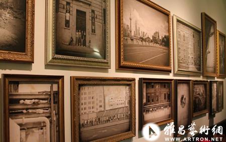
We would like to say, we would have liked for this show to be a Tu Weicheng solo show. And it would have been utterly amazing. His five-part series, parked in the worst possible places — corridors, corners and stairway walls of the first to fifth floors continued his “fake antique” trademark, this time about the Bund and Shanghai. We were very impressed with his fake old photographs. Faking old photographs is a conceptual gimmick that can be cheesy at any point, but he did it with another layer of maneovers. The Taiwanese is a skillful and serious artist, and it shows, from embedding digital screens playing celluloid effected clips into antique analogue cameras, to using human bodies to orchestrate performative actions embedded into fake old photographs of brand new Shanghai, further to designing a scavenge hunt game for people to look for real places in photographs around the Bund. This is an artist who is truly flexible in terms of media, and he took space and time into consideration, when there is no signal for us to believe that this show is supposed to be about the before or now of the Bund. At least for the Shanghai viewers, Tu’s work can be endearing and thought provoking at the same time.
Choi Jeong Hwa
The Korean artist designed the second floor screening room and the pink top floor drop ceilings, which was kind of pretty. They are there, not too interesting, not too shabby, not even too noticeable — in terms of the screening room.
Sam Samore
Here comes a piece we absolutely hated. There is no other word we have for Samore’s film, which is a super cheesy and hysterical “romance fable” or something that didn’t make any sense whatsoever. We don’t think Mr. Samore even speaks Chinese, and how he managed to get a bunch of way, way, way over-acting Chinese speaking people to put together a feature cheesier and dumber than any off-hour melodrama is absolutely astonishing to us. Plus, not only that the subtitle didn’t sync at times, the cuts were senseless lunacy. No matter how much acid you are taking, you won’t be hallucinating about being carried over from one guy to another in slow-mo on Moganshan Road. Well that was a joke. This film was a joke. Waving your video camera toward neon lights isn’t art. Even crazier, the piece is located in the prime spot of the exhibition, in the second floor screening room Choi designed. All we can say is that it takes courage to make something this bad, but it takes more courage to put something this bad in a show.
Sun Xun
To be honest we are Sun Xun-ed out these past weeks. He is literally everywhere. We really liked his drawings in the room. They looked really good. But his animations always scream William Kentridge to us. This piece was no exception. And we can never get any of the ideas he claims to be going after with his work, since we seem to be never patient enough to watch for more than a minute. We are kind of dumb when drawings of bees or ants start to fill up a screen.
Shahzia Sikander/Du Yun
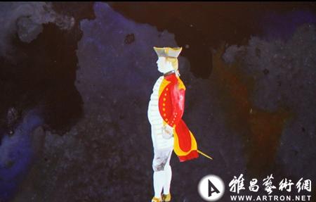
Du Yun’s music was kind of complex and emotional. Sikander made animations about the kings in poker cards, which looked kind of funny. We had no idea what this piece was about, or whether the dancer in the second screen was Du Yun herself. Whoever she was, we get it that she wanted to resolve or provoke tension in and out of herself, but she just seemed very nervous in front of the camera. Not a strong work, but good for young artists.
Nedko Solakov
Let’s sum this up: a 50 something Bulgarian dude took a train from Sofia to Shanghai because he is afraid of flying, and because it was a long journey, he needed company, so he brought a toy toad (an incredibly ugly one at that) as a pet, assumed the toy toad was born in Shanghai and started to have sex with it videograph his journey of bringing a poor, poor orphan toy-in-exile home. Whatever. This is a crazy dude’s youtube channel with a viewership of 30. (Dude you also need a better video camera. Besides being boring and long, your video clips looked like shit on a big screen. We could hardly make out of what you were murmuring to your sex toy.) Poor toad, who has a name, Joji, for no apparent reason. Actually we wish we could go on a free trip like that.
Zhou Tiehai
Zhou’s work is the museum cafe. We didn’t see any art in the cafe though. After we looked hard for it, we realized they were French text printed on glass windows. The booklet explicitly told us they were not just any French, but French even French people can’t read. But whatever language it was, we couldn’t read it anyway, as the text was in such a dark gold color that even the brightest eyes would have difficulty to see. Oh well. (FYI, RAM’s cafe has the most confused waitresses ever. The view is very nice though.)
Hou Hanru
Back to the curator. Hou seems to be a curator who can twist a lot of muscles. And he is nothing short of being totally famous. The lecture speaker list is Bottega Venata impressive. But this show just lacks real content, to the level that we sat there on the cafe balcony, looking over to the adorable Oriental Pearl Tower, thinking that Rockbund might have a budget problem or something. We also flipped through the pamphlets for a few minutes, noting that Yan Jun’s English name is actually Yao Dajun (Friday 12/10), while Choi Jeong Hwa’s work was actually made by Tu Weicheng in English. We should be glad that we read both languages, not so glad that we can read at all. Sloppiness is never good for anyone’s reputation.



 黄琦
黄琦 测试用艺术
测试用艺术